


Let's explore the process of creating a company brand - from choosing a name through creating a logo, colours and typography. It’ll also go through how Kristina and I decided to go into business together, but if you’d rather jump ahead, then feel free to jump ahead.
Kristina and I have known each other going on eight years now. We met at what would become a huge company, but at the time still felt a little like a startup. What about it felt like a startup? Well, that was mostly due the fact that we had a small team that achieved a lot, so we ended up pitching in wherever we could. I split my early days developing operations, sure, but I also helped Kristina upload and update images online and created the odd financial report for accounting. This pressure cooker forged not only our friendship, but our ability to learn quickly and adapt to do whatever job was necessary. It also gave us a birds eye view of what it took to successfully run a business, because between the two of us, we touched every aspect of it.
From there I went on to work for a marketing agency as a project manager. There I managed projects for companies big and small: websites ranging from $5,000 to $50,000, branding projects, custom apps, intranets, print material - the full range. It was really one pressure cooker to another.
Kristina left soon after I did to pursue a career in freelance, wanting more ownership and variety over the types of projects she took on. She developed the brand identity of many businesses, big and small, focusing on the importance of consistency and attention to detail.
So, how did we come back together? Well Kristina lives on Vancouver Island, and I live on the mainland, so get-togethers tend to be far and few between. But when Covid hit, we jumped on that Zoom conference bandwagon and set up a Friday girls night with another friend of ours. We chatted about the crazy world we were living in. I talked about how work was stressful and I really just wanted to spend more time with my daughter who was 9 months old at the time, and how I wanted more control over the clients I took on. Kristina talked about how the freedom of freelance was great, but she struggled with sales and identifying business opportunities. We had joked about going into business together for years, but the timing never seemed quite right - until that moment. It still seemed like a good idea the next morning, and we spent the next week talking through logistics.
New web site platforms like Webflow made optimized, high performing websites out of the custom coded world and into one that we could utilize based on our design and best practice knowledge, without the need (or cost!) of a development team. This meant that we could dramatically expand the services offered between the two of us, and feel good about providing a quality product.
A week of due diligence, soul searching and a virtual handshake later. We made the decision to fulfill a friendship long destiny and go into business together.
1. How to Choose a Company Name
One of the first things we needed to decide on was what to name our company. This process is a bit like naming a child in the fact that it’s deeply personal, and the end result is of a reflection of those who picked it. So how did we land on Larkspur? We went through the following basic steps:
- General brainstorming.
- Setting criteria.
- Picking one theme to explore.
- Committing.
So to start, just brainstorm. Nothing was off the table, we threw out any name that came to us. The goal was two fold - jumpstart the creative process and facilitate a bigger conversation about what we wanted to portray to the world (aka, what we wanted our brand to be about). The first batch of names we came up with ranged from plants on our names, nicknames, my daughter’s name, imagery, service lines, whatever came to mind.
After we had an initial list to work with, we put in place criteria. We did this in order to be 100% clear on our expectations before anyone got too attached to an idea or name. It also gave us another opportunity to communicate what we wanted for the company and who we thought our demographic would be. So what criteria did we end up setting?
- It had to be somewhat unique in order to differentiate ourselves from other businesses.
- There had to be a domain name available. We did not want to get attached to a name only to find that we couldn’t get the domain we wanted. In fact, I’ve had clients go through the process of building a website before realizing that they haven’t bought a domain name. Checking if a domain is really easy - we went to Godaddy.com and used the search bar on the homepage.
- It had to be something that wasn’t already associated with another industry. We didn’t want to be mistaken for a landscaping or gardening site based on the name.
- It had to be fairly gender neutral. We didn’t want to exclude a section of our potential client base by choosing something that came off as too feminine.
After a few conversations, we found ourselves coming back to the idea of “seed” or “sprout”. We liked the idea of having something that evoked nature, as well the idea of growth for our business, our clients and us personally. However, the concept of a seed or spout wasn’t particularly unique and a domain name would be hard to come by. Inspired by our new general direction, I looked to my garden for inspiration. I will be the first to tell you that I do not possess a green thumb (my husband will be the second!). But despite my negligence, we do have bluebells that come back every year. This year, a seed had been carried away from the main plants and nestled itself on the other side of my garden. I loved this idea - that a plant would not only thrive, but travel from its “base of operations” and reach other areas. It was a wonderful metaphor for what digital marketing is all about. However, Kristina and I both agreed that “bluebell” wasn’t really a company name that we wanted. And here’s why - it violated almost all the criteria we had set. But we liked the idea of a plant that is hardy, resistant to the elements and that spreads.
Kristina did some research and found a list of plants that were in the same daily or had similar traits to bluebell. Of these plants Larkspur was the one that stood out to both of us! It was unanimous and a decision was made. From there, we both agreed to commit. As much as naming your company is a hugely important decision, at some point you need to make a decision and move on!
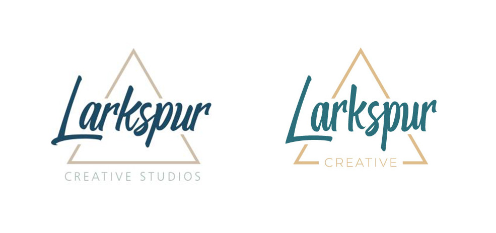
2. How To Create a Logo
Now-that we had a company name, we needed a logo. This process was pretty organic & both of us as we had done it a number of times for other companies, and we’re both pretty, um….let’s say...opinionated?
We started with an internet search of logos we liked, and ones we did not. This is a process we go through with clients as well. It helps us quickly communicate what direction we want to go in with tangible images. So much of a logo can’t be accurately described by words. Ideas like “fresh”, “modern”, “trusting” are really hard to interpret into images the first go around. It’s much easier to look at a set of images and then help a client understand why the like or dislike something.
From there we sent the drawings back and forth. As you can see from the images, one of us (me!) works in analog, while the other (Kristina!) works in digital. And this is why we make such a great team.


Again these initial sketches are helpful for quickly getting a sense of what will work with the elements we want. A shape that looks great on another brand, might not work for us - especially because we wanted to include our company name in the logo. The length and general shape of the letters really impacted the overall balance of the design. We ended up picking the triangle as we felt it fit best with the typography we wanted to utilize.
This process worked for us because we’re both creatively inclined. If you don’t feel like you have the ability to do this, then I would absolutely hire someone to go through this process with you. In fact, you can contact us today for logo services! Ok, shameless plug over.
3. How to Turn a Logo into a Brand
Once we had an initial set of sketches we liked, we worked on the colors we wanted. For us, this turned into a larger discussion about our brand in general as we knew we wanted the website to harmoniously tie into our logo and all make sense together. A brand encompasses more than just a logo and colors. It can, and should, also include decisions about imagery, iconography style. The end goal is for everything you produce to feel like it all belongs together. Each choice should reinforce the last and help your brand become recognizable to the end consumer. There’s a reason why certain fonts are synonymous with Disney or Coke a Cola. We’ve seen them enough times in a consistent format and have formed those associations in our mind.
We wanted to use a mostly blue palette as there is a lot of psychology around colors. It's generally accepted that blue is the best for invoking a sense of trust and integrity, though we could (and probably will) write a whole blog on this topic. Instead of going with a traditional blue, we wanted something a bit more texture and dimension, so we skewed more towards teal. We also wanted to incorporate a tan or wheat color to reinforce a natural palette. We ended up settling on the imagery of mountains/forest with larkspur in the foreground and from that Kristina created a stunning background for the hero of our site. This step isn’t generally necessary as most clients can move directly to color selection, but we were pretty set on wanting a striking visual image as the focal point of our site and creative material.

We then went through and pulled out a color palette from the image by sampling the image. We ended up with 6 colors as we wanted colors not only for the logo, but for creative material as well for text so that all materials produced would work harmoniously together. This was a pretty quick process for us as we already had the image to pull colors from, but it was a process nonetheless to find a set of colors that compliment each other well in any configuration.

4. Tying it all together & finalizing the Logo
Next came the hardest part for us - the font! We both love typography, so finding the perfect font was no small feat. We wanted something readable, even at a small size, but still had some movement like you would find in a script font. The first font we picked had the movement we wanted, but wasn’t quite as legible at a smaller size. We tried a few more, and found a font that we kept coming back to, but just felt slightly off. Kristina made some custom adjustments to make the letters even height and cleaner.
Now that we had our branding in place, creating new materials becomes a relatively quick process. What other things have we created so far? To name a few:
- Email signatures
- Business cards
- Presentation templates
- Document letterhead
- Our website, including this blog page!
And there you have it - our journey from deciding to create a company through developing a logo and branding.
Contact us today to start your branding journey.


